a lazy kind of photo gallery for bear blog
I did a thing! I wanted a photo gallery like Robert with nice thumbnails, but I'm lazy. I didnt want to have to go back and edit the page each time I add a new image. I found I got confused on where to put the new url if I wanted to change up the order. I really like what Jedda came up with, with their setup you can create a new post, add a tag and the photo gets exposed on their gallery page automagically.
I wanted to combine these two things, so I can lazily make a new post, dump in the image, hit publish, and it gets added to the gallery with a thumbnail. Robert referred me to Sylvia's solution, which was extremely close to what I wanted. After some tinkering with Sylvia's code I got this.
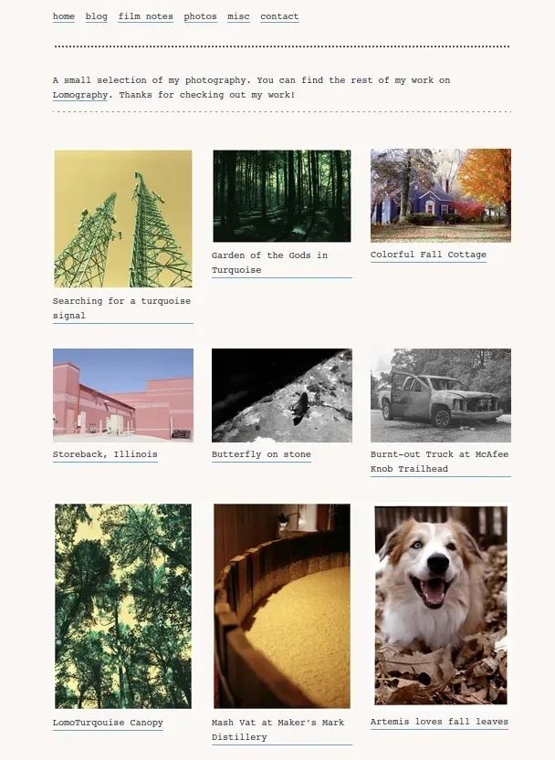
Thumbnails with no cropping, in gridded rows, three per row, and just the title showing. *chef's kiss*. The date is hidden and so is all other post content except the first item which is an image. You can click directly on the thumbnail to view full size, or click on the caption to go to the post itself. I might change it so that the image click brings you to the post instead, not sure. Anyways.
I use a template for new posts, this adds the tag by default.
title:
published_date:
tags: photos
___
[](link)
caption
I can then drag and drop the photo into the prompt. CopyPaste the url to replace the two "(link)" bits. Hit publish and its done.
The photo must be the first item in the post. Any other content will be hidden on the gallery page. This is also styled on just the gallery page, if you wanted this to be universal you could add it to your theme.
I'm no expert in CSS or html so there's likely some more nonfunctional bits that can be cut out. If you find some let me know!
Thanks for reading, have a great day.
-Bruce
Page content
<style>
/* Credit goes to Sylvia and Robert, I just tinkered with it. Also thanks to Jedda for the initial inspiration.*/
/* Gallery styles */
.gallery { /* Gallery width */
  width: 90%;
  position: relative;

}
.gallery ul.embedded.blog-posts {
  display: grid;
  grid-template-columns: repeat(3, 1fr);
  gap: 2em; /* Space in between thumbnails */
  justify-content: center;
  padding: 3em 0; /* Space above & below the gallery */
}
/* Box containing post content */
.gallery ul.embedded.blog-posts > li {
  width: 100%;
  height: min-content;
  font-size: 1em;
  display: flex;
  flex-direction: row; /* Change to "row-reverse" to display post title on left & date on right */
  flex-wrap: wrap-reverse; /* Change to "wrap" to display post title & date above image */
  justify-content: space-between; /* Change to "center" to center post title or date */
  align-items: baseline;
}
.gallery ul.embedded.blog-posts > li div p:first-child {
  margin-top: 0; /* Remove extra space above content */
  margin-bottom: .5em; /* Space in between image and post title */
}
/* Post title */
.gallery ul.embedded.blog-posts > li > a {
  /* Add display: none; to hide post title */
}
/* Date */
.gallery ul.embedded.blog-posts > li span:has(> i time) {
  /* Add display: none; to hide date */
   display: none;
}
/* Post body */
.gallery ul.embedded.blog-posts > li > div {
  flex-basis: 100%;
}
.gallery ul.embedded.blog-posts > li > div > p img {
  object-fit: contain;
  width: 100%; /* Resize to desired width */
  height: 100%; /* Resize to desired height */
}
.gallery ul.embedded.blog-posts > li > div > p:nth-child(n+2) {
  display: none; /* Hides content after image */
}

</style>

___


<section class="gallery">

{{ posts | tag:photos | content:True | limit:10 }}

</section>
___
Example post content
title: Searching for a turquoise signal
link: searching-for-a-turquoise-signal
published_date: 2025-02-25 11:31
tags: photos
___
[](url)
A really awesome caption
___